Wednesday 11 December 2013

Dem Photoshop Skills

One tip I've neglected to mention is how I create hair on photoshop. In some of my previous projects the hair was commented upon, much to my bashful surprise. The hair in this project isn't quite as up to scratch, but nevertheless, here is my method:


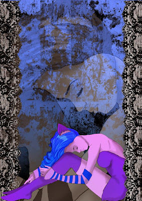
This image in particular, a depressed, cat, pin-up type character, the hair was a more bold style and less smudgey than I've used in this project.


I began with the shape, and one shade of blue. After establishing where the light source was, I added the highlights. Not very exciting, but I used a lighter shade of the original colour. This was applied using the chalk brush on about 11 pixels, as well as the standard hard round brush. This, and a lot of patience for drawing many lines. After this, the shading areas were achieved using the burn tool. Simply, I burned the shaded areas, so as to achieve a better shade than just black on top of a normal colour. Specifically, I selected midtone burning, about 15ish % exposure, varying a little for darker shades, while trying to be subtle about it.

 Here's a helpful bigger image.

To see a more defined image, go ahead and click here (= I'll be sure to write a more complete and detailed version of this method another time, perhaps not the night before handing my work in...

Monday 9 December 2013

AOI sneak peek


The Association of Illustrators, better known as the AOI is a group who works to keep professional illustration standards high, as well as protecting the rights of illustrators. It also however has a blog and a selection of portfolios! How is this helpful? Because as part of my third year work I am working on a blog (obviously) and a portfolio!

Here is a little link to the website I'm taking about....

Basically, I'm including this website in my blog, because it a source of information about how to keep my portfolio to a certain level, and it provides examples of other artists who's portfolios I can aspire to be as good as. Also the blog, though quite straightforward will hopefully help me to improve my future blogs.

...Hopefully.

Imagine FX; one magazine to rule them all..?


Imagine FX. A magazine based on the artwork of Sci-fi and fantasy works. It's full of everything from step by step tutorials on how to begin processes like becoming a games designer, beginning a character and how to design a layout. Its got tips about how to approach conventions, and questions sent in by aspiring artists.

It's helpful tutorials alone would be reason enough to get this magazine, but all the interviews and beautiful artwork make this magazine stand out. Its helped me with my thought process of the proper way to begin a character and how to work on textures the right way on Photoshop. I'd recommend this to anyone wanting to get some tips on breaking into the professional fantasy art world, without trying to sound like an absolute advert for this magazine, its awesome. (=

Thursday 28 November 2013

Fantasy ++++++

"Fantasy+" compiled by Vincent Zhao


Fanatasy+ is exactly what it advertises. A book portraying the merits of some of the best professional Chinese CG artists including pages of full colour work, advice from the artists themselves as well as background on some brilliant artists that I was blissfully unaware of.


One artist I used in my coursework was Yonjie Lee, his sideways facing female composition was helpful when designing my own, plus the messy, almost painted feel to his work made the whole thing seem more raw, less CG than the rest of the work in the book. Which appeals to me personally, but also looks really effective.
The work of Yonjie Lee

Monday 25 November 2013

Photoshop: Back Painting

Photoshop. Its never ending series of buttons of mystery. As i continue to use the programme I'm planning to document any handy ideas I come acorss, and today that is 'back painting'. This involves taking the inital skecth after its been scanned into photoshop, and dragging its layer to the "new layer" icon at the bottom.
After this, a layer called "Layer 1 copy" appears. Selecting the layer type, you choose the "multiply" option, which allows you to use the paint tool to colour the image faster on the original layer, while maintaining a clear, uncoloured image in the copied layer.


This method provides a faster means of colouring in accurately, plus by highlighting a certain section of the drawing, it means any shading will not go over the lines, which is often a problem for me.

Thursday 31 October 2013

Character Mentor Lessons

Tom Bancroft wrote this book called "Character Mentor" which is ridiculously helpful. It's full of little tricks and methods that help with the whole process of designing characters effectively, most of which I now employ in my own work. He goes through everything from facial expressions and the importance of a head tilt to centering and balancing a character from initial sketch to finished composition. I found a copy on Amazon and I now use it every time I begin a new sketch (= Helpfulness level: over 9000.


"Character Mentor" by Tom Bancroft

Thursday 26 September 2013

Blog numero juan (=

These blogs are basically my online version of a diary for all the arty programmes, terms and general interesting things I find during my final year of university. I'll also post any artwork I do that I consider the great achievement of 'not terrible'. 

First off is a love letter to my shoes.